The Evolution of Credit Card Design: From Plastic to Personal Statement
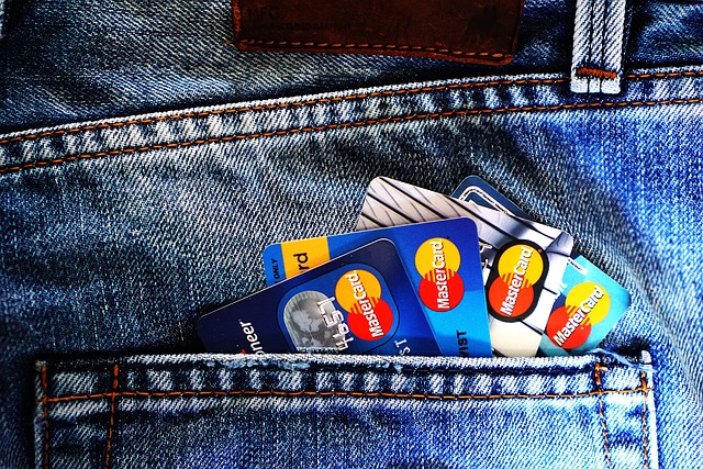
Credit cards have transformed from plain plastic payment tools into carefully crafted objects that say something about the people who carry them. Materials, colors, layouts, and even digital elements now play a role in how these cards feel, look, and communicate identity in everyday transactions.

Payment cards have quietly evolved from simple pieces of plastic into small, portable design statements. As much as they are financial tools, they have also become reflections of personal style, lifestyle choices, and even social identity. The journey from early embossed plastic to sleek metal, minimalist layouts, and app-linked experiences shows how design has become central to how people experience everyday payments.
What makes a “cool” card in today’s market?
The idea of a “cool” payment card today is shaped by more than just color or logo. It blends materials, visual simplicity, and how the card works in both physical and digital spaces. Metal cards feel heavier and more durable, giving a sense of solidity that many users associate with reliability and prestige. Others prefer ultra-light, flexible cards that stay unobtrusive in a slim wallet or phone case.
Minimalist layouts are widely seen as modern and appealing. Many newer designs move numbers, expiry dates, and security codes to the back of the card, leaving the front clean and uncluttered. This not only looks contemporary but also makes it harder for people nearby to glimpse sensitive information. Contactless symbols, small chips, and subtle logos are integrated in a way that supports both aesthetics and usability.
Another element of coolness is how well the physical card connects with the digital experience. A thoughtfully designed card that matches the colors and styles used in its companion mobile app feels more cohesive. Users often notice when the physical and digital experiences feel out of sync, so consistent branding, iconography, and color schemes can influence how attractive a card seems overall.
Customization options: colors, engravings, and personal touches
Personalization has become a major part of payment card design. Instead of accepting a single standard look, many people now expect some choice, whether that means picking a color, finish, or pattern. Some issuers offer a range of palettes from understated monochrome to bold, high-contrast combinations, allowing users to align their card with their wardrobe, phone case, or personal style.
Engraving is another way people add individuality. Names, initials, or even short phrases can be etched or printed in distinctive typefaces. This approach gives the card a more bespoke feel, closer to a personal accessory than a generic financial tool. In some regions, customers can upload images or choose from pre-approved artwork, resulting in cards that feature landscapes, abstract graphics, or cultural symbols that resonate with the cardholder.
Texture and finish are also becoming part of the customization story. Matte surfaces, soft-touch coatings, or brushed-metal looks can dramatically change how a card feels in the hand. Tactile elements like raised logos or patterned surfaces make it easier to distinguish one card from another without looking, which adds a small but meaningful functional benefit.
Digital customization plays a growing role as well. Some mobile wallets and banking apps allow users to adjust the appearance of their virtual cards with themes or dynamic backgrounds. While these changes do not alter the physical card, they extend the sense of personalization into the digital environment where many people now interact with their payment details most often.
How design became a status symbol in the card world
The status aspect of payment cards emerged gradually as issuers sought to differentiate between products aimed at different customer segments. Early designs were mostly about function: embossed numbers, magnetic stripes, and simple logos. As competition increased, design began to signal features like travel benefits, rewards structures, or service levels, even if those features were not explicitly visible on the card itself.
Physical cues became shorthand for perceived prestige. Thicker or heavier cards, dark color palettes, and minimalist branding started to imply exclusivity. A card that made a noticeable sound when placed on a counter or felt weighty when handed over could subtly communicate that it belonged to a premium tier. For some users, this effect is appealing; for others, it can feel performative, highlighting the tension between practicality and status.
Social media amplified the idea of cards as status symbols. Photos and videos of distinctive metal or limited-edition designs reinforced the association between certain looks and particular lifestyles. Unboxing experiences, special packaging, and unique presentation folders extended design thinking beyond the card itself to the entire moment of receiving it.
At the same time, there is a growing push toward more inclusive and responsible design. Some people value cards that visually reflect sustainability goals, such as those made partly from recycled materials or ocean-bound plastics. Others prioritize discrete designs that do not draw attention at all. In this sense, status is no longer just about appearing luxurious; for many, it includes communicating values like environmental awareness or simplicity.
The evolution from plain plastic to personal statement highlights how design now serves multiple roles at once. A modern payment card must be secure, durable, and compatible with global payment systems while also operating as an everyday object people feel comfortable showing and using. As materials, technology, and expectations continue to change, card design will likely keep balancing function, identity, and subtle forms of status in the palm of a hand.


